Theme settings are accessed by navigating to Themes and on a theme pressing Theme settings. The theme settings are unique to each theme and a part of the theme files, they can be modified in the theme editor.
All themes come with theme settings that can be customized in the theme code editor.
You control the theme settings from the files found in the config directory.
settings.jsoncontains definitions for the settings.settings_data.jsoncontains saved settings data.
settings.json file
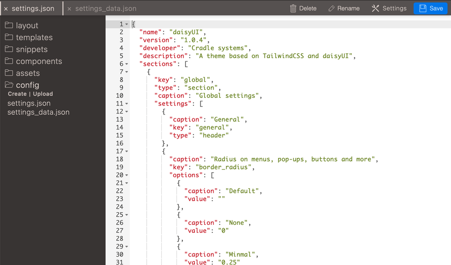
The settings.json file includes the settings that theme users see when clicking on the theme-settings, these are defined with JSON and can be of many different types.
The settings file contains theme general information with the fields name, and a description of the theme as well as developer and version. The description property could contain a link to support documentation of the theme. These fields are followed by one or several sections that the users can click into.
Example of a basic settings.json file.
{
  "name": "Theme name",
  "version": "1.0.4",
  "developer": "Cradle systems",
  "description": "A theme description",
  "sections": [
	  {
		  <place for the main sections>
		}
	]
}
Sections
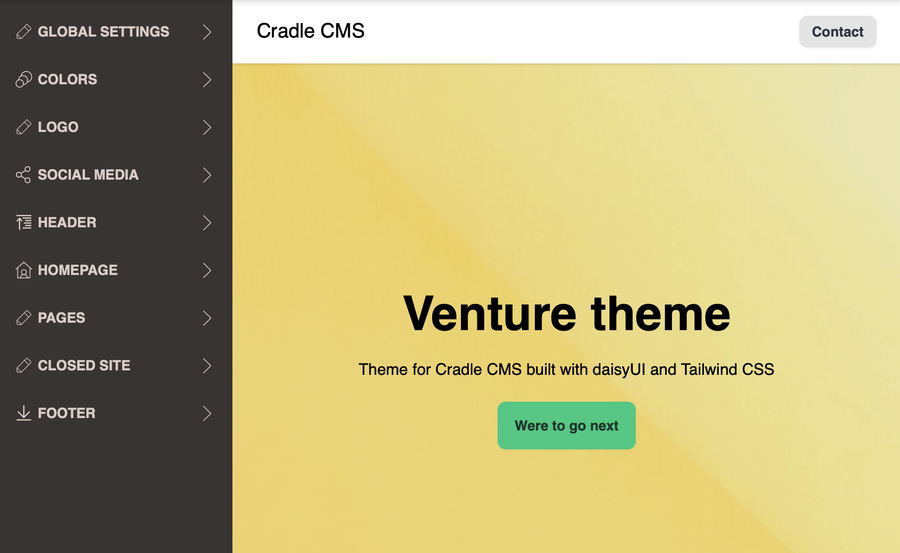
Main sections group theme settings to provide a better overview.
The sections consists of a key, type and a caption which is the header displayed in the theme settings view. You can specify the key as you like but some sections have been “standardised” with predefined icons. type is always set to section.
Example of a settings section
    {
      "key": "global",
      "type": "section",
      "caption": "Global settings",
      "settings": [
					<place for theme settings>
			]
    }
List of standard theme setting sections
| Key | Glyph | Description |
|---|---|---|
| “colors” | O | Color settings |
| “typography” | icon:font[] | Font settings |
| “header” | icon:arrow-up[] | Site header |
| “footer” | icon:arrow-down[] | Site footer |
| “social_media” | icon:facebook[] | Social media settings |
| “homepage” | icon:home[] | Frontpage of the site |
| “products” | icon:tags[] | Product settings |
| “collections” | icon:archive[] | Product collection settings |
| “cart” | icon:shopping-cart[] | Cart settings |
| “blog” | icon:calendar[] | Blog settings |
| “page” | icon:pencil[] | Page settings |
Settings
You group settings into sections which are then displayed in a menu under theme settings. Each setting has a key as a unique identifier, type for the input type and a caption for the heading. Optionally also a description for providing more information.
Types of theme settings: header, text, number, checkbox, color, asset, font, select, blog, page, collection, navigation and struct.
header
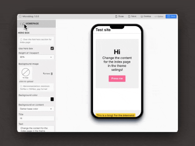
In a main section, a header can be used for displaying a title in the theme settings for clarity.
{
	"caption": "General colors",
	"key": "general",
	"type": "header"
}
text
Text settings are used for displaying text input fields.
Example of a text setting
        {
          "caption": "Title",
          "key": "headerTitle",
          "type": "text"
        }
NOTE By using a
max-lengthattribute you can specify max length of the text.
Example of using text setting in the theme code inside a <h2> element
<h2>{{ settings.headerTitle }}</h2>
textarea
Textarea setting is used for text consisting of several sentences.
Example of textarea setting
    {
        "caption": "About us text",
        "key": "footerAboutShop",
        "rows": 6,
        "type": "textarea"
    }
NOTE The
rowsattribute allows to specify the height of the textarea but is optional.
checkbox
The checkbox type is used for displaying a checkbox input.
Example of a checkbox setting
        {
          "caption": "Use Custom Logo",
          "key": "logoUseImage",
          "type": "checkbox"
        }
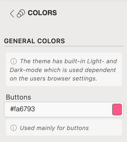
color
The color setting displays a color selector in the theme settings.
Example of a color setting
{
	"caption": "Background color",
	"key": "colorBg-0",
	"type": "color"
}
Example
Defining a CSS variable with the color setting makes changing the colors of the whole website easy.
:root {
	--bg-0: {{ settings.colorBg-0 | def:'#fff' }};
}

html {
	background-color: var(--bg-0);
}
number
Number setting is for specifying a number.
Example of setting in settings.json file
 {
	"caption": "Related limit",
	"key": "relatedArticlesLimit",
	"type": "number",
	"min": "2",
	"max": "16",
	"step": "2",
	"default": "4"
}
Setting used in theme
{% for a in article | related | limit:settings.relatedArticlesLimit %}
     <h4>{{ a.title }}</h4>
{% endfor %}
The liquid filters for math can be used to specify the breakpoints from the settings.
min-width: {{ settings.breakpointSmall | plus: 1 }}px);
select
The select settings displays a select box with options.
Example of a select setting
        {
          "caption": "Size",
          "key": "imageSize",
          "options": [
            {
              "caption": "Small, 150px",
              "value": "150"
            },
            {
              "caption": "Medium, 300px",
              "value": "300"
            },
            {
              "caption": "Maximum, 500px",
              "value": "500"
            }
          ],
          "type": "select"
        }
image
The image setting allows for file uploads into media and supports png, jpg and svg formats.
Example of a image setting
        {
          "caption": "Icon",
          "description": "40px x 40px png",
          "filename": "icon.png",
          "key": "faviconImage",
          "format": "image/png",
          "max-height": 32,
          "max-width": 32,
          "type": "image"
        }
| Setting | Explanation |
|---|---|
| filename | The image file will use the filename specified and the format is converted to the file format specified. If you upload a file.svg file the conversion is made to a .jpg upon upload if filename is set to image.jpg. |
| format | The format specifies the MIME type (image/png, image/svg+xml, image/jpg) and specifies what can be uploaded in the setting. |
When uploading to a non-struct image setting. By default, the uploader enforces a unique filename, so that other files are not overwritten by accident due to clashing filenames. the uploaded appends a
-nsuffix to the file, i.efile-2.jpg.
asset
The asset setting allows for file uploads into assets, such as font files.
Example of a asset setting
        {
          "caption": "Font",
          "key": "fontFile",
          "type": "asset"
        }
TIP The
descriptionattribute can be used on all settings and it shows up as a help text under the input field.
blog
The blog setting allows users to select an available blog.
Example of a blog setting
        {
          "caption": "Blog",
          "default": "Select blog",
          "key": "homepageBlog",
          "type": "blog"
        }
article
The article setting allows users to select an article.
Example of a article setting
        {
          "caption": "Article",
          "default": "Select article",
          "key": "indexArticle",
          "type": "article"
        }
page
The page setting allows users to select an available page.
Example of a page setting
        {
          "caption": "Page",
          "default": "Select page",
          "key": "homepagePage",
          "type": "page"
        }
link-list (navigation)
The navigation setting allows users to select a navigation linklist.
Example of a linklist setting
        {
          "caption": "Main navigation",
          "key": "mainNav",
          "type": "linklist"
        }
struct
The struct setting allows you to define a group of settings that can be added or removed in blocks.
Example of a struct setting
        {
          "caption": "Select link lists",
          "description": "Create link-lists under Navigation",
          "key": "footerLinklists",
          "settings": [
            {
              "caption": "Link list",
              "default": "footer",
              "key": "footerLinklist",
              "type": "linklist"
            }
          ],
          "type": "struct"
        }
On struct fields the filename, possible to specify on images, is not enforcable, it keeps the original uploaded name.
collection (for eCommerce)
The collection setting allows users to select a collection.
Example of a collection setting in settings.json file
	{
		"key": "homepageCollection",
		"caption": "Feature products from this collection",
		"type": "collection",
		"default": "Select collection"
	}
Using the setting in a theme.
{% assign collection = collections[settings.homepageCollection.id] %}
<section class="collection-row-container">
  {% for product in collection.products limit:5 %}
    {% include 'productCard' %}
  {% endfor %}
</section>
Accessing theme settings
Theme settings are accessed in template files through the settings object.
Example accessing a theme setting in this case mypropertyEnabled.
<label>Myproperty
<input name="mycheckbox" {% if settings.mypropertyEnabled %}checked{% endif %}/>
</label>